Column Chart Visualization
Column Chart Visualization
Column Charts are used for showing data changes over a period of time or for illustrating comparison among items. In Column Charts, categories are along the horizontal axis and values along the vertical axis.
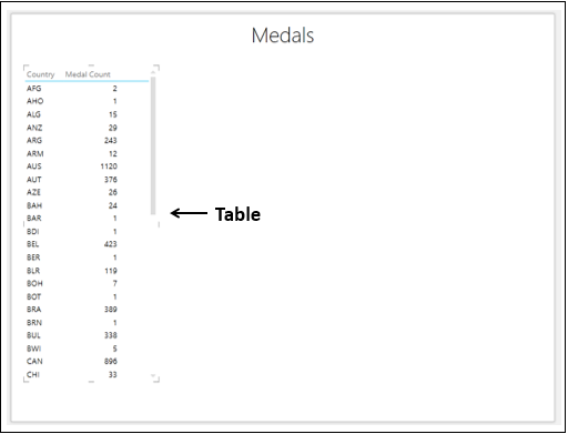
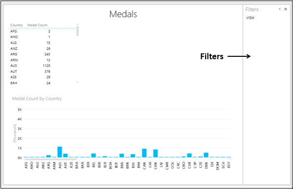
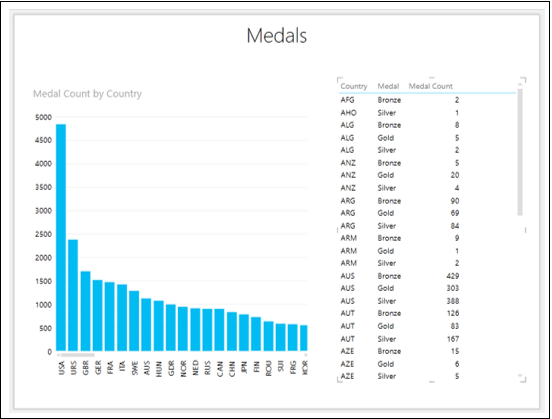
You have learnt in the previous chapters, you need to start with a Table and then convert it to Column Chart visualization.
Select the fields – Country and Medal Count. By default, Table will be displayed.
Types of Column Chart Visualization
In Power View, there are three types of Column Chart visualization −
- Stacked Column.
- 100% Stacked Column.
- Clustered Column.
Switching to Column Chart Visualization
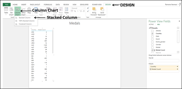
Convert the Table to Column Chart as follows −
- Click on the Table.
- Click the DESIGN tab.
- Click Column Chart in the Switch Visualization group.
- Select Stacked Column from the dropdown list.
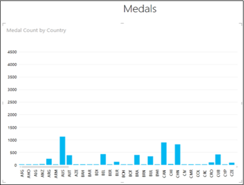
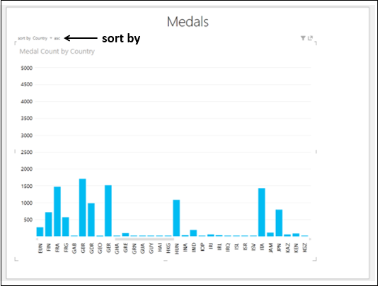
The Table will be converted to Column Chart. The X-axis values are sorted by the category values in ascending order.
Exploring Data with Column Chart Visualization
You can explore data with Column Chart in several ways. You will understand the various methods that you can use for data visualization and exploration with Column Chart in this section and the subsequent sections.
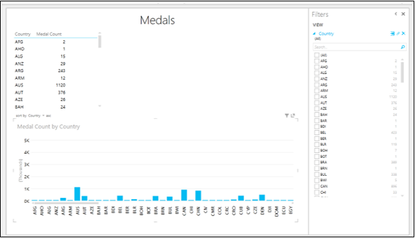
In the Column Chart, the categories are distributed evenly along the x-axis and not all the categories (countries in this case) are visible in the display. To view the categories that are not in the display, do the following −
-
Click and hold on the Category (x-axis) axis.
-
Drag to left or right. The categories to the left or right will be displayed and the Column Chart will be displayed accordingly.
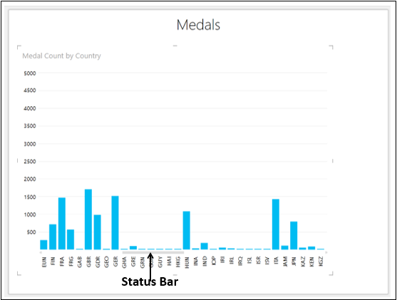
The Status Bar shows you the position of the current display as compared to the complete category range. You can drag the Status Bar also to the left or right to display the categories that are on the left or right side of the current display.
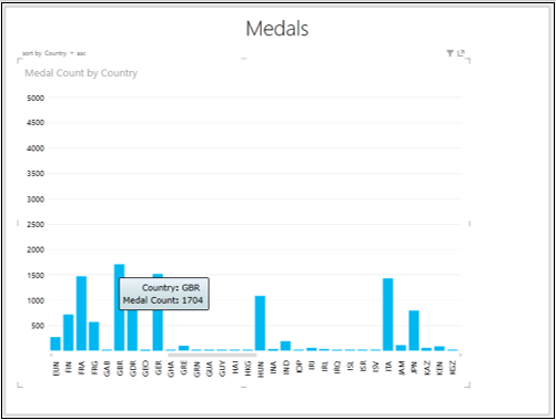
You might want to know the data values of a Column on the Column Chart.
Place the cursor on the Column on the Column Chart. The values corresponding to that Column will be displayed at that Column.
Sorting in Column Chart
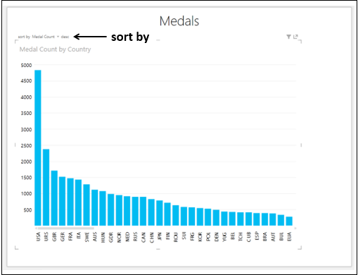
You can sort the X-axis values in Column Chart by the Medal Count as follows −
On the top left corner, you will see – sort by Country asc. This means the sorting is by Country and in ascending order.
-
Click on Country. It will change to Medal Count.
-
Click on asc. It will change to desc. The Column Chart will be sorted by Medal Count in descending order.
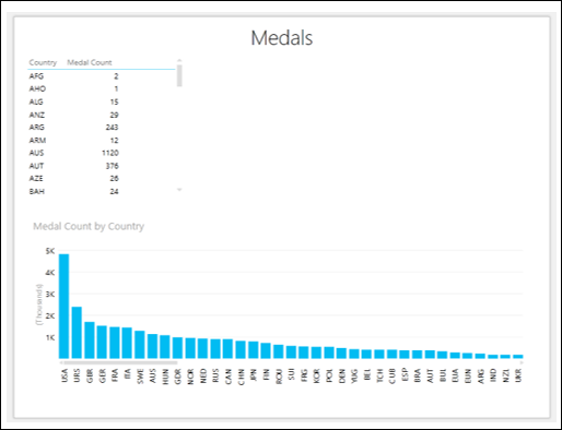
Combination of Column Chart and Table Visualizations
You can view the interactive features of Column Chart visualization by placing a Table on the same Power View.
-
Create a Table with the fields – Country and Medal Count.
-
Adjust the sizes and positions of Column Chart and Table to appear as below.
Click on the Filters area. As you have not yet selected any fields for filtering, the Filters area will be empty.
Drag the field Country from Power View Fields list to the Filters area.
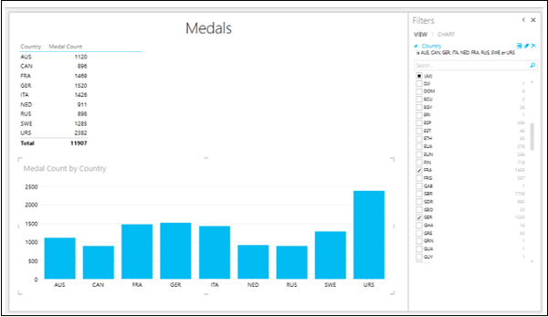
Check the boxes for the countries that you want display the results. Both Table and Column Chart are filtered to show only the filtered data.
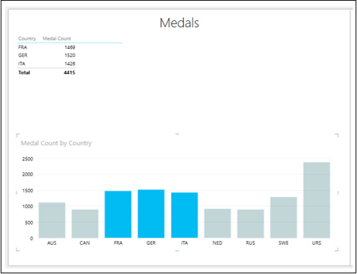
Click on the Columns for FRA, GER and ITA with the Ctrl key pressed. These Columns will be highlighted and others will become inactive. The Table is also filtered to show the values only for the highlighted Columns.
Adding a Legend
You will understand some powerful features of a Column Chart by adding a Legend.
Arrange the Column Chart and Table to be side by side.
- Click on the Column Chart.
- Drag the field Medal to LEGEND area.
- Click on the Table.
- Drag the field Medal to FIELDS area.
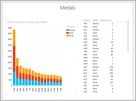
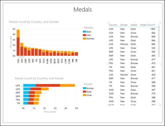
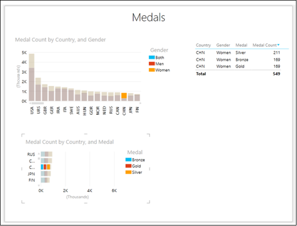
The illustration give above is the full-fledged Stacked Column Chart visualization, showing the Medal Count by Medal type for each Country.
Click on the top portion of the Column for GBR.
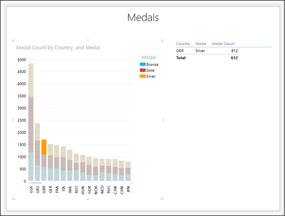
You will observe the following −
-
Only the orange color portion of the Column for GBR on which you clicked will be highlighted.
-
The other two portions of the Column for GBR will become inactive.
-
All other Columns will become inactive.
-
The Table will be filtered to show only the values of highlighted region.
Note − You cannot make multiple selections in this case.
100% Stacked Column Chart
You can convert the Stacked Column Chart to 100% Stacked Column Chart as follows −
- Click on the Stacked Column Chart.
- Click the DESIGN tab on the Ribbon.
- Click Column Chart.
- Select 100% Stacked Column from the dropdown list.
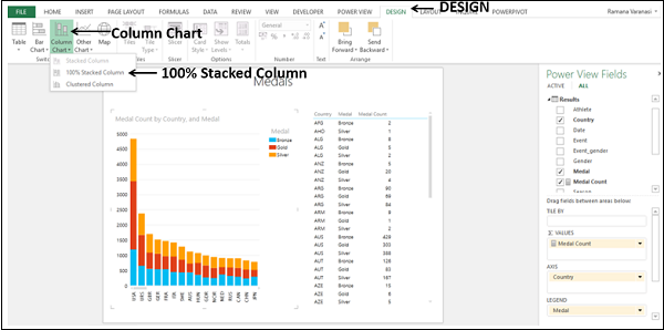
The Stacked Column Chart will be converted to 100% Stacked Column Chart.
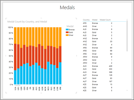
From the Chart, you can visualize the Gold, Silver and Bronze ratios of the total Medal Count for each Country.
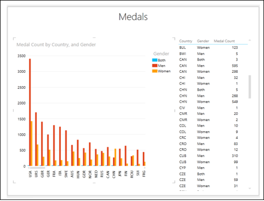
You can also visualize the ratio of the Medals won by Men and Women for each Country. Remove the field Medal and add the field Gender to both Column Chart and Table.

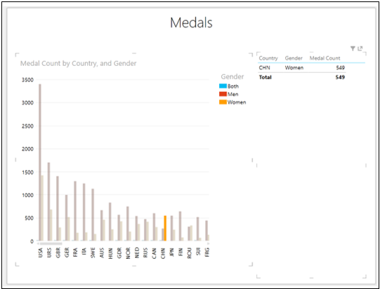
For CHN, the Medal Count of Women is more than that of Men as against other countries. Scroll down the Table to view the values for CHN.
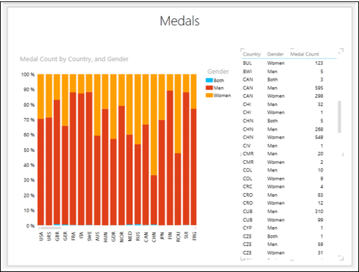
In country CHN, the Medal Count of Men is 268 and that of Women is 549.
Click on the X-axis and drag to view the other countries.
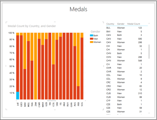
You can find other countries, where women outperformed men.
Clustered Column Chart
You can convert the 100% Stacked Column Chart to Clustered Column Chart as follows −
- Click on the 100% Stacked Column Chart.
- Click the DESIGN tab on the Ribbon.
- Click Column Chart.
- Select Clustered Column from the dropdown list.
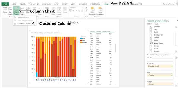
The 100% Stacked Column chart will be converted to Clustered Column chart.
Click on the orange Column for CHN.
You will observe the following −
-
Only the selected Column will be highlighted. The other Columns will be deactivated.
-
The Table also shows only the corresponding values.
Combining Bar Chart Visualization
To understand the interactive features of Power View Chart visualizations more in depth, place the following visualizations on a Power View sheet −
- Table with the fields – Country, Medal, Gender and Medal Count.
- Stacked Column Chart with fields – Country, Gender and Medal Count.
- Stacked Bar Chart with fields – Country, Medal and Medal Count.
- Sort all the three visualizations by Medal Count in descending order.
Click on the Gold part of USA on the Stacked Bar Chart.
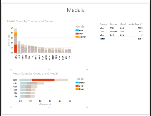
You will observe the following −
-
Stacked Bar Chart – Only the selected portion is highlighted.
-
Stacked Column Chart – Data related to selected portion of the Stacked Bar Chart is highlighted.
-
Table – Data is filtered to display only the values pertaining to both the Charts.
Next, do the following −
- Click on the top portion for CHN on the Stacked Column Chart.
- Drag the y-axis on the Stacked Bar Chart to view CHN.
You will observe the following −
-
Stacked Column Chart – Only the selected portion is highlighted.
-
Stacked Bar Chart – Data related to selected portion of the Stacked Column Chart is highlighted.
-
Table – Data is filtered to display only the values pertaining to both the Charts.