Excel Data Analysis - PivotTables
Excel Data Analysis - PivotTables
Data analysis on a large set of data is quite often necessary and important. It involves summarizing the data, obtaining the needed values and presenting the results.
Excel provides PivotTable to enable you summarize thousands of data values easily and quickly so as to obtain the required results.
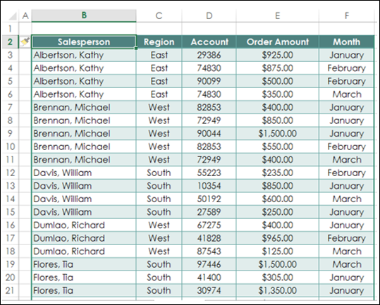
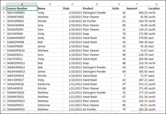
Consider the following table of sales data. From this data, you might have to summarize total sales region wise, month wise, or salesperson wise. The easy way to handle these tasks is to create a PivotTable that you can dynamically modify to summarize the results the way you want.
Creating PivotTable
To create PivotTables, ensure the first row has headers.
- Click the table.
- Click the INSERT tab on the Ribbon.
- Click PivotTable in the Tables group. The PivotTable dialog box appears.
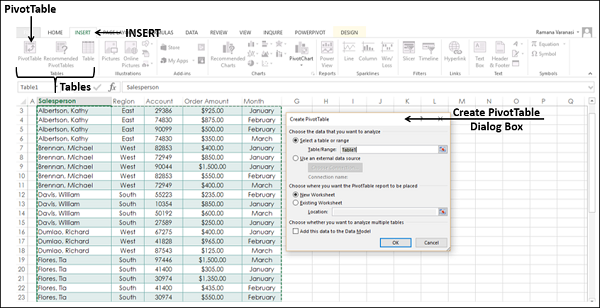
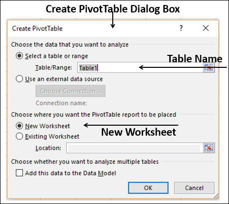
As you can see in the dialog box, you can use either a Table or Range from the current workbook or use an external data source.
- In the Table / Range Box, type the table name.
- Click New Worksheet to tell Excel where to keep the PivotTable.
- Click OK.
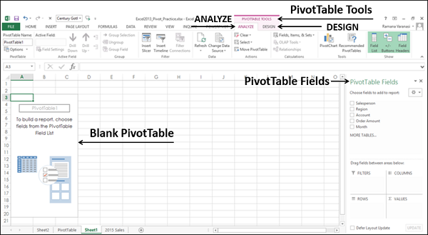
A Blank PivotTable and a PivotTable fields list appear.
Recommended PivotTables
In case you are new to PivotTables or you do not know which fields to select from the data, you can use the Recommended PivotTables that Excel provides.
-
Click the data table.
-
Click the INSERT tab.
-
Click on Recommended PivotTables in the Tables group. The Recommended PivotTables dialog box appears.
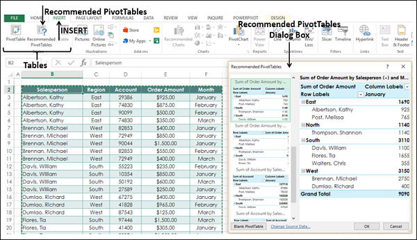
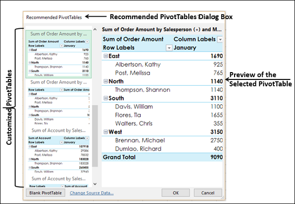
In the recommended PivotTables dialog box, the possible customized PivotTables that suit your data are displayed.
- Click each of the PivotTable options to see the preview on the right side.
- Click the PivotTable Sum of Order Amount by Salesperson and month.
Click OK. The selected PivotTable appears on a new worksheet. You can observe the PivotTable fields that was selected in the PivotTable fields list.
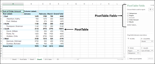
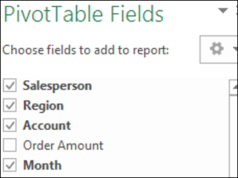
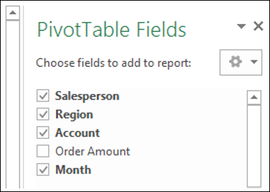
PivotTable Fields
The headers in your data table will appear as the fields in the PivotTable.
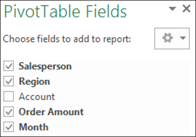
You can select / deselect them to instantly change your PivotTable to display only the information you want and in a way that you want. For example, if you want to display the account information instead of order amount information, deselect Order Amount and select Account.
PivotTable Areas
You can even change the Layout of your PivotTable instantly. You can use the PivotTable Areas to accomplish this.
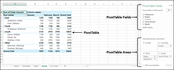
In PivotTable areas, you can choose −
- What fields to display as rows
- What fields to display as columns
- How to summarize your data
- Filters for any of the fields
- When to update your PivotTable Layout
- You can update it instantly as you drag the fields across areas, or
- You can defer the update and get it updated only when you click on UPDATE
An instant update helps you to play around with the different Layouts and pick the one that suits your report requirement.
You can just drag the fields across these areas and observe the PivotTable layout as you do it.
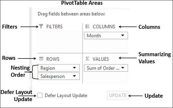
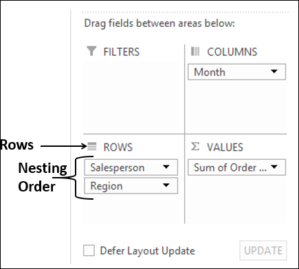
Nesting in the PivotTable
If you have more than one field in any of the areas, then nesting happens in the order you place the fields in that area. You can change the order by dragging the fields and observe how nesting changes. In the above layout options, you can observe that
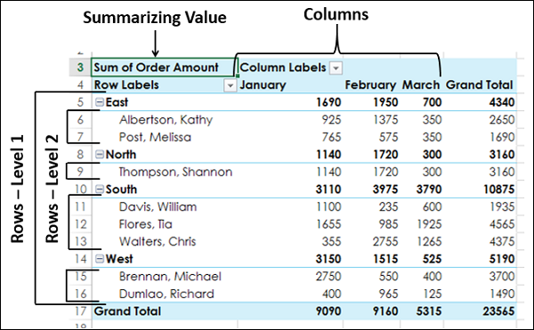
- Months are in columns.
- Region and salesperson in rows in that order. i.e. salesperson values are nested under region values.
- Summarizing is by Sum of Order Amount.
- No filters are chosen.
The resulting PivotTable is as follows −
In the PivotTable Areas, in rows, click region and drag it below salesperson such that it looks as follows −
The nesting order changes and the resulting PivotTable is as follows −
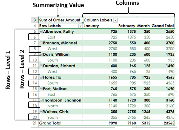
Note − You can clearly observe that the layout with the nesting order – Region and then Salesperson yields a better and compact report than the one with the nesting order – Salesperson and then Region. In case Salesperson represents more than one area and you need to summarize the sales by Salesperson, then the second layout would have been a better option.
Filters
You can assign a Filter to one of the fields so that you can dynamically change the PivotTable based on the values of that field.
Drag Region from Rows to Filters in the PivotTable Areas.
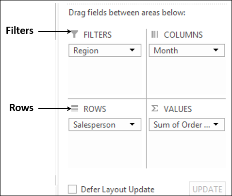
The filter with the label as Region appears above the PivotTable (in case you do not have empty rows above your PivotTable, PivotTable gets pushed down to make space for the Filter.
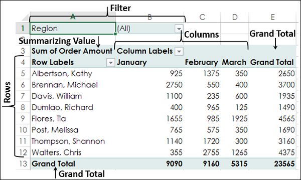
You can see that −
- Salesperson values appear in rows.
- Month values appear in columns.
- Region Filter appears on the top with default selected as ALL.
- Summarizing value is Sum of Order Amount
- Sum of Order Amount Salesperson-wise appears in the column Grand Total
- Sum of Order Amount Month-wise appears in the row Grand Total
Click the arrow in the box to the right of the filter region. A drop-down list with the values of the field region appears.
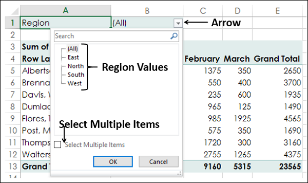
- Check the option Select Multiple Items. Check boxes appear for all the values.
- Select South and West and deselect the other values and click OK.
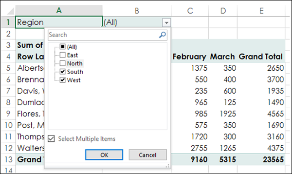
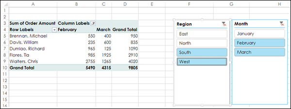
The data pertaining to South and West Regions only will be summarized as shown in the screen shot given below −
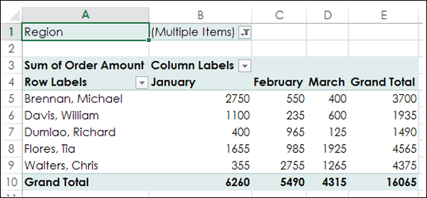
You can see that next to the Filter Region, Multiple Items is displayed, indicating that you have selected more than one item. However, how many items and / or which items are selected is not known from the report that is displayed. In such a case, using Slicers is a better option for filtering.
Slicers
You can use Slicers to have a better clarity on which items the data was filtered.
-
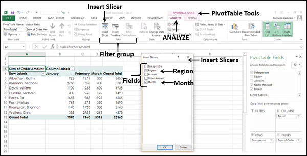
Click ANALYZE under PIVOTTABLE TOOLS on the Ribbon.
-
Click Insert Slicer in the Filter group. The Insert Slicers box appears. It contains all the fields from your data.
-
Select the fields Region and month. Click OK.
Slicers for each of the selected fields appear with all the values selected by default. Slicer Tools appear on the Ribbon to work on the Slicer settings, look and feel.
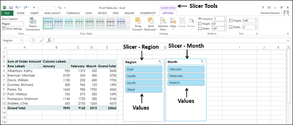
- Select South and West in the Slicer for Region.
- Select February and March in the Slicer for month.
- Keep Ctrl key pressed while selecting multiple values in a Slicer.
Selected items in the Slicers are highlighted. PivotTable with summarized values for the selected items will be displayed.
Summarizing Values by other Calculations
In the examples so far, you have seen summarizing values by Sum. However, you can use other calculations also if necessary.
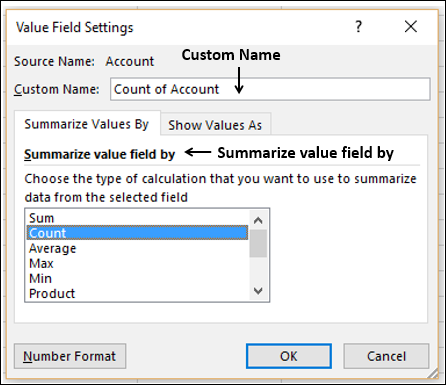
In the PivotTable Fields List
- Select the Field Account.
- Unselect the Field Order Amount.
- Drag the field Account to Summarizing Values area. By default, Sum of Account will be displayed.
- Click the arrow on the right side of the box.
- In the drop-down that appears, click Value Field Settings.
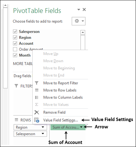
The Value Field Settings box appears. Several types of calculations appear as a list under Summarize value field by −
- Select Count in the list.
- The Custom Name automatically changes to Count of Account. Click OK.
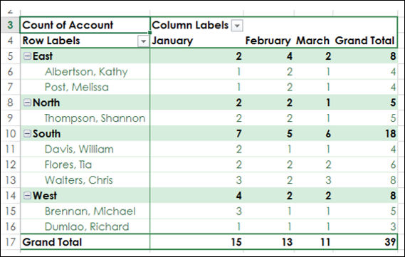
The PivotTable summarizes the Account values by Count.
PivotTable Tools
Follow the steps given below to learn to use the PivotTable Tools.
- Select the PivotTable.
The following PivotTable Tools appear on the Ribbon −
- ANALYZE
- DESIGN
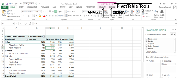
ANALYZE
Some of the ANALYZE Ribbon commands are −
- Set PivotTable Options
- Value Field Settings for the selected Field
- Expand Field
- Collapse Field
- Insert Slicer
- Insert Timeline
- Refresh Data
- Change Data Source
- Move PivotTable
- Solve Order (If there are more calculations)
- PivotChart
DESIGN
Some of the DESIGN Ribbon commands are −
- PivotTable Layout
- Options for Sub Totals
- Options for Grand Totals
- Report Layout Forms
- Options for Blank Rows
- PivotTable Style Options
- PivotTable Styles
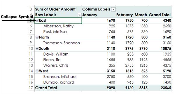
Expanding and Collapsing Field
You can either expand or collapse all items of a selected field in two ways −
- By selecting the symbol
![Excel Data Analysis - PivotTables]() or
or![Excel Data Analysis - PivotTables]() to the left of the selected field.
to the left of the selected field. - By clicking the Expand Field or Collapse Field on the ANALYZE Ribbon.
By selecting the Expand symbol![Excel Data Analysis - PivotTables]() or Collapse symbol
or Collapse symbol![Excel Data Analysis - PivotTables]() to the left of the selected field
to the left of the selected field
- Select the cell containing East in the PivotTable.
- Click on the Collapse symbol
![Excel Data Analysis - PivotTables]() to the left of East.
to the left of East.
All the items under East will be collapsed. The Collapse symbol to the left of East changes to the Expand symbol
 .
.
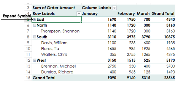
You can observe that only the items below East are collapsed. The rest of the PivotTable items are as they are.
Click the Expand symbolto the left of East. All the items below East will be displayed.
Using ANALYZE on the Ribbon
You can collapse or expand all items in the PivotTable at once with the Expand Field and Collapse Field commands on the Ribbon.
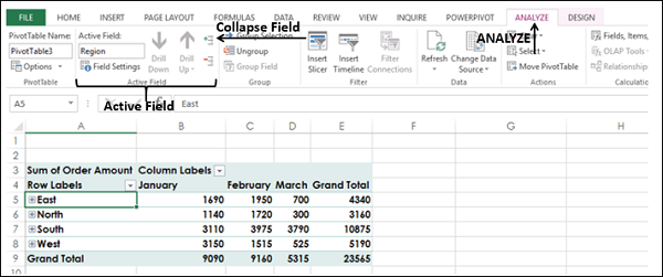
- Click the cell containing East in the PivotTable.
- Click the ANALYZE tab on the Ribbon.
- Click Collapse Field in the Active Field group.
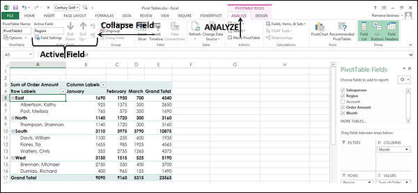
All the items of the field East in the PivotTable will collapse.
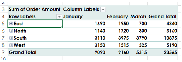
Click Expand Field in the Active Field group.
All the items will be displayed.
Report Presentation Styles
You can choose the presentation style for your PivotTable as you would be including it as a report. Select a style that fits into the rest of your presentation or report. However, do not get over bored with the styles because a report that gives an impact in showing the results is always better than a colorful one, which does not highlight the important data points.
- Click East in the PivotTable.
- Click ANALYZE.
- Click Field Settings in Active Field group. The Field Settings dialog box appears.
- Click the Layout & Print tab.
- Check Insert blank line after each item label.
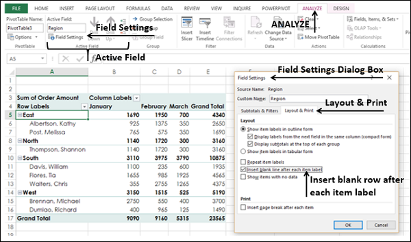
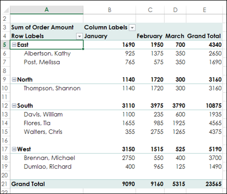
Blank rows will be displayed after each value of the Region field.
You can insert blank rows from the DESIGN tab also.
- Click the DESIGN tab.
- Click Report Layout in Layout group.
- Select Show in Outline Form in the drop-down list.
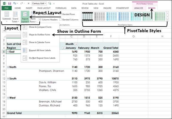
- Hover the mouse over the PivotTable Styles. A preview of the style on which the mouse is placed will appear.
- Select the Style that suits your report.
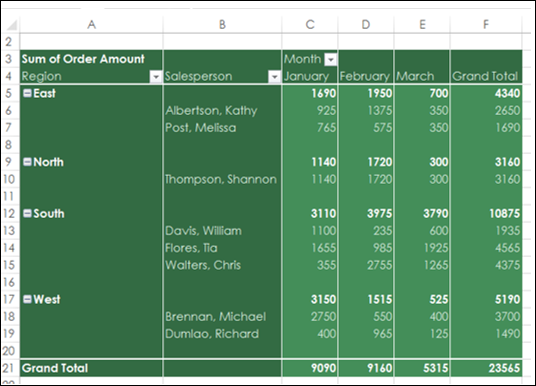
PivotTable in Outline Form with the selected Style will be displayed.
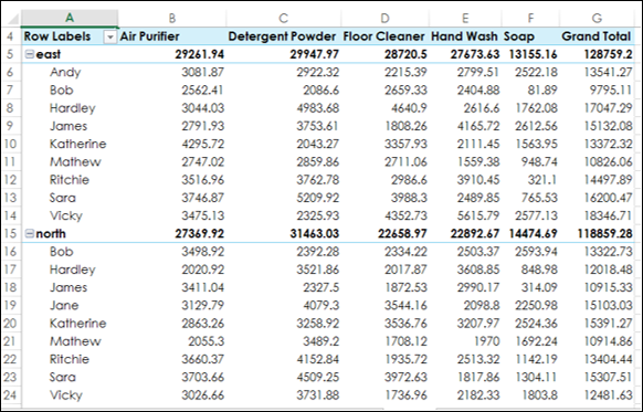
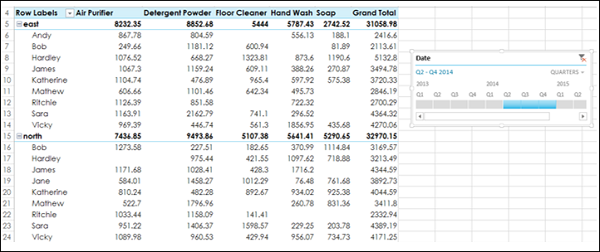
Timeline in PivotTables
To understand how to use Timeline, consider the following example wherein the sales data of various items is given salesperson wise and location wise. There are total 1891 rows of data.
Create a PivotTable from this Range with −
- Location and Salesperson in Rows in that order
- Product in Columns
- Sum of Amount in Summarizing values
- Click the PivotTable.
- Click INSERT tab.
- Click Timeline in Filters group. The Insert Timelines appears.
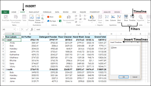
Click Date and click OK. The Timeline dialog box appears and the Timeline Tools appear on the Ribbon.
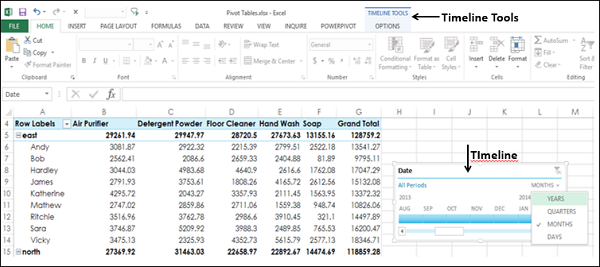
- In Timeline dialog box, select MONTHS.
- From the drop-down list select QUARTERS.
- Click 2014 Q2.
- Keep the Shift key pressed and drag to 2014 Q4.
Timeline is selected to Q2 – Q4 2014.
PivotTable is filtered to this Timeline.
Frequently Asked Questions
Recommended Posts:
- Excel Data Analysis Tutorial
- Data Analysis - Overview
- Data Analysis - Process
- Excel Data Analysis - Overview
- Working with Range Names
- Excel Data Analysis - Tables
- Cleaning Data with Text Functions
- Cleaning Data Containing Date Values
- Working with Time Values
- Excel Data Analysis - Conditional Formatting
- Excel Data Analysis - Sorting
- Excel Data Analysis - Filtering
- Exploring Data with PivotTables
- Exploring Data with Powerpivot
- Exploring Data with Power View